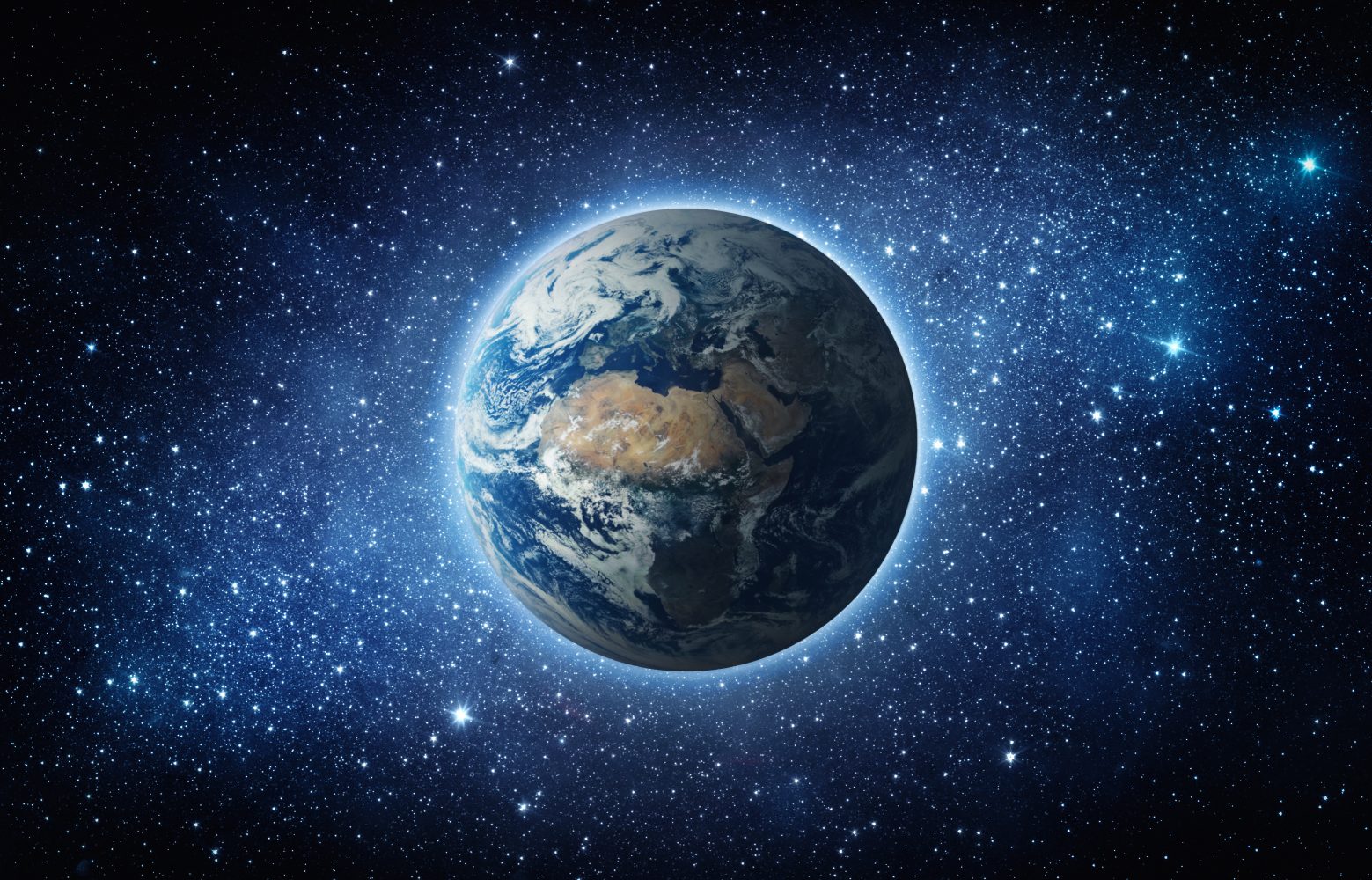
Every map of the world that you have ever seen is inaccurate. Well, of course, you might think. How could they map out the world when it’s round, not flat? True. But that isn’t the point. See, the world maps we’ve been using for centuries don’t show the most accurate appearance of the landmasses, either. But the Equal Earth World Map is changing that.
Cartographers presented this solution in a new article published in the International Journal of Geographical Information Science. According to that new article, this new world map is not only the most accurate ever created, but it actually showcases the proper size of the landmasses and continents that make up our planet.
The Equal Earth World Map builds off previously released maps like the Mercator projection map and the Gall-Peters projection map. However, these two maps had problems of their own. The first, the Mercator projection map, shows everything where it should be, but it makes landmasses further from the equator appear larger than they actually are.
The Gall-Peters projection map addressed part of this issue by making the landmasses more rounded to what they should look like. However, it distorted the shape of the continents. As such, it didn’t provide an accurate view of the world, either.
The Equal Earth World Map, on the other hand, builds on a combination of these two—a hybrid map known as the Robinson projection map, which took bits and pieces of each map to make it highly suitable for world maps. The authors of the new study say it provided the best foundation for their new, more accurate map, though they worked to retain the relative size of areas, something the Robinson map struggled to do.
As it stands, this new map may very well be the most accurate world map that we have ever seen. It not only portrays the landmasses as accurate size, but it also portrays them as their accurate shape, too. This, thereby, resolves the two issues that the previously accepted world maps suffered from.
Sure, it might not be as impressive as creating a 3D map of the entire universe. However, the Equal Earth World Map could help redefine how schools and institutions showcase our planet to billions of students every day.
The post Every world map you’ve seen is wrong – this is what maps should look like appeared first on BGR.
Today’s Top Deals
Today’s deals: $719 Black Apple Watch Ultra 2, Bissell Little Green, heated jackets, self-bagging trash can, more
Best deals: Tech, laptops, TVs, and more sales
Today’s deals: $20 Waterproof Bluetooth speaker, $999 M3 MacBook Air, Duracell batteries, Cosori air fryer, more
Today’s deals: $40 Magic Bullet, $38 Sony Bluetooth speaker, $25 myQ, Energizer batteries, more
Every world map you’ve seen is wrong – this is what maps should look like originally appeared on BGR.com on Wed, 18 Dec 2024 at 16:48:00 EDT. Please see our terms for use of feeds.
